Virus wrote:
sturmgewehr is an american company of heroes clan (how ironic lol)
dude, i have/had over 200 c4d render on my pc <3
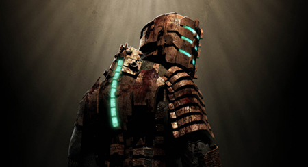
but why blue? i think red or brown is just perfect for this render, but show me, if i might think wrong ;)
edit:
i just noticed, that i lost all my c4d render, all my tuts, all my brushes -.-
status, if you need some c4d renders, here are 327 (255mb)
http://www.gfx-location.de/files/C4D_Render.rar (pw is:
http://www.gfx-sector.de)
I personally think blue would be better because the glow from his body is blue. It would just "fit" a bit better, as with this:

Also, cheers for the C4Ds - can never have enough

Virus wrote:
I'll tip you for the Habbe one, as it's better.
First off, the backrguond is kind of inconsistent.. it looks great on the right, some really nice splatter -- but you have a completely different pattern on the left. It's good that you added some flow -- looks like a wireframe C4D, and you're off to a good start if you can use those -- but the main problem is still a) the white stuff on the left; and b) the white stuff on the right, right next to the dude.
Try to make a similar background all around. Once you've done that, you need to put focus on the render. The first step to this is to make a new layer, apply the image, and get your burn tool out (300px 100% soft brush), and carefully darken the edges. You can remove any irregularities separately by brushing over them with regular black or something on a new layer. Examples:
Not great examples, but you can see what I mean.
What is good is that you blended the dude into the background at least a bit... I think that tut is much needed; I'll work on getting it back.
Phoenix7015 wrote:
Thanks for the advice, status. I'll try the smudging. The background right by the clone is actually just the part of the clone picture I didn't erase though...
The font is called "birth of a hero" from dafont I think.
Maybe we should copy over some of the tutorials that were on the old forums...?
Yeah, I know the font; it's one of my favourites
. It's quite hard to use in sigs though, but you applied it very well :0
N'Core | Gr/\phit wrote:
c4d-render, Huh?
Kinda overrated nowadays :o
They are quite cliché, but they wouldn't be out of place here ;)


![[hi]](images/smilies/Why%20hullo%20thur.gif "[hi]")


 ) but, what do you think of it? :O