http://www.guildinn.com/forum/beginners/5968-my-2nd-tutorial.html
try that one, helped me really much at the beginning
![[hi]](images/smilies/Why%20hullo%20thur.gif "[hi]")
| RedCell Forum https://redcellgaming.com/forum2/ |
|
| My signatures https://redcellgaming.com/forum2/viewtopic.php?f=66&t=720 |
Page 2 of 4 |
| Author: | StatusQ3 [ Thu Nov 06, 2008 9:06 pm ] |
| Post subject: | Re: My signatures |
Habbe wrote: you should try to smudge in the render so it's like part of the bg and get rid of this white stuff on the right side You will see how to do this in tutorials ;) |
|
| Author: | Habbe [ Thu Nov 06, 2008 10:12 pm ] |
| Post subject: | Re: My signatures |
http://www.guildinn.com/forum/beginners/5968-my-2nd-tutorial.html try that one, helped me really much at the beginning
|
|
| Author: | Phoenix7015 [ Fri Nov 07, 2008 1:37 am ] |
| Post subject: | Re: My signatures |
Oh great sig master status, how would you rate this? Some random person wanted me to make them a sig a while ago... |
|
| Author: | StatusQ3 [ Fri Nov 07, 2008 7:41 am ] |
| Post subject: | Re: My signatures |
It's a bit of a different style than the average sig, but I like the concept =) (by "rate" I assume you mean "improve"?) First of all, the main problem for me is that there are two focal points -- your eye is drawn to the massive text as well as the tiny clone. You will want to keep the clone, so I'd say make him take up a bit more of the sig space. You can keep him roughly in the right side, but make him take up about 1/3 of the canvas (a good idea is to change the sig so that it's taller and not so wide: leaves you with more render and less empty space), so that one can see him more clearly. Also, remove the clone in the background. Once you've done that, you need to do the same thing as I've told Zero: not to make it fit with the background, because you've done teh colour scheme really well; but to smudge on top of the render to make it seem like it is part of the background. What I mean: The sig itself isn't great for examples, but note how it looks like it's part of the background ... this, roughly, is what you need. Okay, if you've done that, I suggest reducing the size of the text so that it fits better with what you've now made. Your typography is excellent, especially the splatter on FS. Just ctrl+click all the text layers and ctrl+t so that they take up the bottom third or so of the canvas. Tuck it away a bit behind the clone for some additional effect, if that looks good. Overall, the sig isn't horrible at all, the main problem is the inconsistency of the background... simple on one side, detailed on the other; a lot of depth on one side, not a lot on the other, etc.. Gj=] EDIT: OR, you can disregard that last bit completely, if you want a smoother, slicker kind of sig. For this, remove your clone altogether, and replace it with the background you have everywhere else. Focus on flow and lighting, use brightness contrast and other adjustment layers, etc.. I'd keep typing, but I gtg =P. You get the idea, I'm sure... |
|
| Author: | Virus [ Fri Nov 07, 2008 9:57 am ] |
| Post subject: | Re: My signatures |
status, can you make me a dead space sig? ^^ i think your sig is awsome 
|
|
| Author: | StatusQ3 [ Fri Nov 07, 2008 4:41 pm ] |
| Post subject: | Re: My signatures |
Well ty, but I don't do requests at all, with some very rare exceptions :P If I can find a good Deadspace stock, I'll make something with that =) |
|
| Author: | Virus [ Fri Nov 07, 2008 5:16 pm ] |
| Post subject: | Re: My signatures |
would be nice sir maybe this: http://ps3.pspfreak.de/wp-content/gioct.jpg or this: http://i174.photobucket.com/albums/w91/ ... space1.jpg but i think, this one is just the best 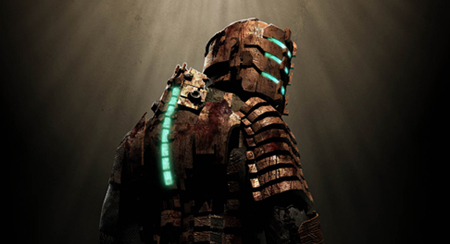 just this pic with a nice "Virus" font on it. thats not a request, that only would be very nice of you ;) btw, what do you think of that one:  thats not from me, my friend his clanleader made it for him |
|
| Author: | StatusQ3 [ Fri Nov 07, 2008 6:31 pm ] |
| Post subject: | Re: My signatures |
Virus wrote: would be nice sir maybe this: http://ps3.pspfreak.de/wp-content/gioct.jpg or this: http://i174.photobucket.com/albums/w91/ ... space1.jpg but i think, this one is just the best just this pic with a nice "Virus" font on it. thats not a request, that only would be very nice of you ;) btw, what do you think of that one: thats not from me, my friend his clanleader made it for him First stock is alright, might use it =] Sig you posted: Ok, this sig is a noob plus, so to speak. It's still basically a background with a render on top, but the background has some quite nice smudge. One thing though: there is a gap in the smudge to the immidiate right of the render, then it continues further on. He needs to move this (just lasso tool will do) into the open space. That will boost it by 50% alone. The bg gives some depth, but the render still needs to be integrated more into the bg. There are tuts for this. It is good that he has used red as a theme, but I actually think that blue would have been better, considering that's the colour the radiation is in. He should have either: a) kept the red background and changed colour of radiation (or just made it fainter); or b) had a blue background. This sig and render is waving a big sign that says "USE C4DS ON ME". Either that, or some splatter effects. I made a tut on this, since it's basic and crucial, and can also give some rly nice effects if you master it, but I lost it. Lol. I'll write it up if anyone needs it rly bad. Also, tell him that his text is good... but text sucks overall. Basically no one uses it, apart from gamer-siggers... |
|
| Author: | Virus [ Fri Nov 07, 2008 7:15 pm ] |
| Post subject: | Re: My signatures |
sturmgewehr is an american company of heroes clan (how ironic lol) dude, i have/had over 200 c4d render on my pc <3 but why blue? i think red or brown is just perfect for this render, but show me, if i might think wrong ;) edit: i just noticed, that i lost all my c4d render, all my tuts, all my brushes -.- status, if you need some c4d renders, here are 327 (255mb) http://www.gfx-location.de/files/C4D_Render.rar (pw is: www.gfx-sector.de) |
|
| Author: | Virus [ Fri Nov 07, 2008 9:58 pm ] |
| Post subject: | Re: My signatures |
my try: blue thingy: edit: lighted i think, they arent very good (stq yours will be better  ) but, what do you think of it? :O ) but, what do you think of it? :Oi personally think, the blue one is ok, but the red one is shit (cuz i made it from the blue one^^, just colored and fixed something) after some tipps of habbe:
|
|
| Author: | Phoenix7015 [ Fri Nov 07, 2008 11:18 pm ] |
| Post subject: | Re: My signatures |
Thanks for the advice, status. I'll try the smudging. The background right by the clone is actually just the part of the clone picture I didn't erase though... The font is called "birth of a hero" from dafont I think. Maybe we should copy over some of the tutorials that were on the old forums...? |
|
| Author: | N'Core | Gr/\phit [ Fri Nov 07, 2008 11:53 pm ] |
| Post subject: | Re: My signatures |
c4d-render, Huh? Kinda overrated nowadays :o |
|
| Author: | Virus [ Sat Nov 08, 2008 2:57 am ] |
| Post subject: | Re: My signatures |
why :o |
|
| Author: | StatusQ3 [ Sat Nov 08, 2008 11:49 am ] |
| Post subject: | Re: My signatures |
Virus wrote: sturmgewehr is an american company of heroes clan (how ironic lol) dude, i have/had over 200 c4d render on my pc <3 but why blue? i think red or brown is just perfect for this render, but show me, if i might think wrong ;) edit: i just noticed, that i lost all my c4d render, all my tuts, all my brushes -.- status, if you need some c4d renders, here are 327 (255mb) http://www.gfx-location.de/files/C4D_Render.rar (pw is: http://www.gfx-sector.de) I personally think blue would be better because the glow from his body is blue. It would just "fit" a bit better, as with this: Also, cheers for the C4Ds - can never have enough  Virus wrote: I'll tip you for the Habbe one, as it's better. First off, the backrguond is kind of inconsistent.. it looks great on the right, some really nice splatter -- but you have a completely different pattern on the left. It's good that you added some flow -- looks like a wireframe C4D, and you're off to a good start if you can use those -- but the main problem is still a) the white stuff on the left; and b) the white stuff on the right, right next to the dude. Try to make a similar background all around. Once you've done that, you need to put focus on the render. The first step to this is to make a new layer, apply the image, and get your burn tool out (300px 100% soft brush), and carefully darken the edges. You can remove any irregularities separately by brushing over them with regular black or something on a new layer. Examples: Not great examples, but you can see what I mean. What is good is that you blended the dude into the background at least a bit... I think that tut is much needed; I'll work on getting it back. Phoenix7015 wrote: Thanks for the advice, status. I'll try the smudging. The background right by the clone is actually just the part of the clone picture I didn't erase though... The font is called "birth of a hero" from dafont I think. Maybe we should copy over some of the tutorials that were on the old forums...? Yeah, I know the font; it's one of my favourites . It's quite hard to use in sigs though, but you applied it very well :0N'Core | Gr/\phit wrote: c4d-render, Huh? Kinda overrated nowadays :o They are quite cliché, but they wouldn't be out of place here ;) |
|
| Author: | Virus [ Sat Nov 08, 2008 1:05 pm ] |
| Post subject: | Re: My signatures |
thank you for the tips status, but i have to say, that i touched ps the first time after 3 months i just read a small tut and then i worked on my own in the next times i will work more with ps, and listen to your tips |
|
| Page 2 of 4 | All times are UTC |
| Powered by phpBB © 2000, 2002, 2005, 2007 phpBB Group http://www.phpbb.com/ |
|